TOAST AFFAIR
Toast Affair is an editorial café concept that turns food into a form of self-expression, rooted in bold femininity and soft rebellion, the brand elevates the familiar; a simple slice of toast into something emotional, expressive, and full of character. The name blends “toast”, the most humble, everyday staple, with “affair”, a word that suggests intimacy, indulgence, and something you choose because it feels personal. It’s a celebration of the ordinary made intentional and place where simplicity meets sentiment.
Duration
3 Weeks
Field
Brand Identity Brand Strategy Spatial Direction Packaging
Research & Insights

Problem Statement: Most of India's café look alike, offer the same menus, and lack a distinct point of view. Young consumers want cafés with identity, storytelling, and emotional relevance.
Positioning: An editorial café where food, fashion, and self-expression meet, built on bold femininity and soft rebellion. It creates a space for people to be playful and powerful, elegant and unfiltered, where dining becomes a language of confidence & character, every experience invites guests to be unapologetically themselves.
Target Audience: Studies show that women aged 18–35 drive trends, influence venue choices, and determine what gains online traction. They value expressive, layered environments.
Concept: Open toasts work as a creative base, they’re simple, versatile, and visually expressive. Using fashion’s A/W and S/S seasonal structure turns the café into a dynamic, ever-evolving experience. Limited menu drops, shifting palettes, and changing moods create anticipation and repeat visits.
Moodboard

Logo Exploration

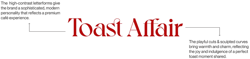
I explored typographic styles and illustrative directions to define the brand’s personality. From refined serifs to playful motifs like hands and bread icons, each iteration tested how the brand could balance charm and clarity. It helped clarify direction that feels both inviting and authentic.
Logo: Wordmark
Logo: Symbol

Color Palette
The darker shades evoke comfort & indulgence, while the lighter hues add approachability and a modern charm to the brand.


Brand Pattern

Brand Collaterals


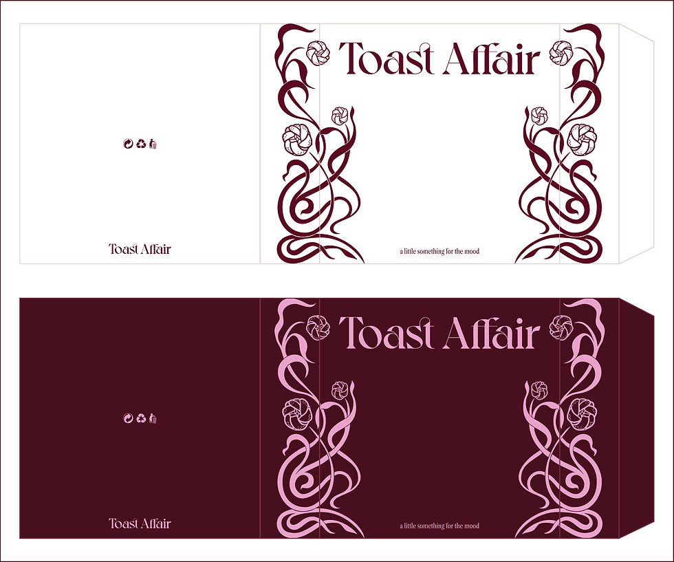
Takeaway Packaging: The Aubergine Prism Box
Designed as part of the premium limited-edition collection, this takeaway box is designed to feel more like a statement accessory than packaging. Its structured form and elegant detailing give it a clutch-like presence, turning the simple act of carrying food into a moment of style and indulgence.


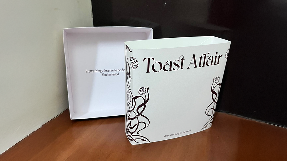
Takeaway Packaging: The Pull-Out Box
Designed for everyday orders, it balances visual charm with practical efficiency. It’s clean structure, floral detailing, and sturdy build make it production-friendly yet refined. The pull-out format adds a subtle sense of unboxing, slowing the moment, creating anticipation, and elevating an ordinary meal.