

SLAP!
SLAP! is an American-style popcorn brand designed to make snacking feel exciting, expressive, and full of character. Built around a playful visual language, the identity combines bold typography, vibrant colors, and illustrated mascots to create a distinctive brand experience that captures the fun and spontaneity of American-style popcorn culture.
Duration
1 Month
Studio
Sanz Serif
Field
Brand Identity
Packaging
Brand System
Logo Concept Boards

Logo Options
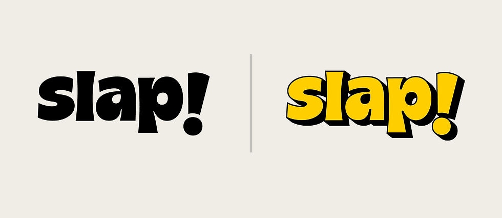
Bold, custom typography creates a playful and energetic identity, while exaggerated letterforms give the logo a distinctive personality. The dimensional shadow adds depth and impact, making it pop off the pack and stand out on shelf.

Custom bold typography creates a playful and confident identity, while the custom exclamation mark, inspired by lightning and thunder, represents the energy and impact of "SLAP!".

Inspired by the soft, organic form of popped popcorn, the custom typography creates a playful and approachable identity. Rounded letterforms give the logo a friendly, nostalgic character.

The rounded wordmark draws inspiration from the soft, organic form of popped popcorn to create a playful and approachable personality, while the angular version expresses movement, confidence, and the bold energy of "SLAP!".
Logo
This custom typeface is loud, playful, and memorable. It's chunky forms communicates confidence while being approachable and friendly.

The exaggerated drop shadow adds depth and movement, making the logo feel as though it's popping off the pack.
Packaging Variations

Concept 1
The packaging system is built around bold flavour icons and vibrant colour palettes, allowing each variant to have its own distinct personality while maintaining a cohesive brand identity. Large illustrative graphics make flavour recognition quick, intuitive, and engaging, creating a playful shelf presence across the entire range.

Concept 2
Inspired by the moment popcorn pops, the packaging transforms the burst of flavour into it's visual language. Dynamic explosion graphics become the hero element, creating a playful and energetic identity that reflects the brand's loud personality. Across the range, each flavour is distinguished through unique colours and flavour illustrations while the signature burst remains constant.

Concept 3
Inspired by vintage American popcorn packaging, this concept reinterprets retro aesthetics through a vibrant colour palette tailored for the Indian market. Classic label-inspired graphics are paired with bold colours and playful patterns, creating a nostalgic yet contemporary identity.

Concept 4
Designed for the Indian market, the packaging embraces bold colours and radiating graphic patterns inspired by the impact and energy of the word "SLAP!". The dynamic rays create a sense of movement and excitement, giving the pack a striking shelf presence. Across the range, each flavour is differentiated through unique colour combinations while the signature burst patterns.
(Curious about the concept? Hover over the images to learn more).


Final Packaging

The Idea Behind It
The final packaging system brings the brand's playful personality to life through expressive typography, hand-drawn illustrations, and a cast of cheerful mascots. Each mascot interacts with its corresponding flavour, adding character and a memorable visual experience. A soft pastel colour palette, inspired by American snack culture, gives the range a fresh and approachable feel while helping each flavour stand apart.

Brand Application


