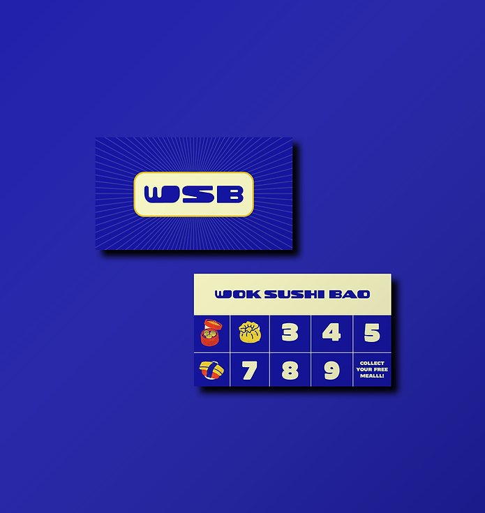
WOK SUSHI BAO
Wok Sushi Bao is a Pan-Asian quick-service restaurant inspired by the energy and cultural richness of Asia. Combining fast service and accessible dining with a bold visual identity, the brand translates the vibrancy of Asian food culture into a playful, contemporary experience for today's generation of food enthusiasts.
Duration
3 Months
Studio
Sanz Serif
Field
Positioning Research
Brand Strategy
Brand Identity
Brand System
Packaging
Logo Concept Boards

Logo Options
(Curious about the concept? Hover over the images to learn more).

Inspired by Japanese street signage, this concept translates layered signboards into a bold, dimensional logo. The 3D treatment adds depth and presence, while the typography draws from vintage Asian signboards to create a familiar yet contemporary feel.

A bold, custom display typeface inspired by Asian street food culture. Rounded, chunky letterforms create a playful and approachable feel, while the dimensional shadow adds depth and energy, giving the logo a strong, impactful presence.

This direction explores a more expressive identity through the use of a mascot paired with thick, bubble-style typography. The bold, rounded letterforms create a sense of approachability and playfulness, making the brand feel friendly, energetic, and easy to connect with.

A bold, rounded display typeface creates a strong, friendly, and highly legible logo. Inspired by traditional Chinese motifs, the repeating circular pattern adds cultural character and visual rhythm, balancing modern typography with heritage-inspired details.

A bold, edgy typeface with sharp, irregular forms creates a raw, street-driven attitude. The layered square base adds depth and dimension, drawing inspiration from stacked signage and pasted posters to give the logo a strong, impactful presence.
Final Logo
The logo functions as a mark of legitimacy, craft, and origin.

The bold, dense typography reflects the visual language of street-side signage across Asian markets.
It is inspired by Pan-Asian stamp traditions; from Japanese hanko seals to Chinese red chops.
Drawing from the symbolism of the sun across East Asian cultures; the monogram represents energy, vitality, and continuity.

The radiating lines echo traditional sun motifs seen in flags, prints, and signage, often used to signify power, warmth, and presence.


Packaging


.jpg)


Brand Applications


.png)