
PETIT PEP
Petit Pep is a sustainable baby care brand that supports parents through every stage of their child’s growth. It’s name blends Petit meaning “little” in French with Pep, symbolizing energy and vitality. The brand embodies warmth, trust, and playfulness celebrating the joy of early parenthood through a modern, eco-conscious identity.
Duration
4 Weeks
Field
Brand & Identity
Design
Research & Keywords

Target Audience: Millennial and Gen Z parents value sustainability, transparency, and personalization. They prefer brands that align with their eco-conscious, inclusive lifestyles.
Market Analysis: Research revealed a gap between clinical minimalism and overly cute aesthetics in baby-care brands. We bridge this gap with a modern, minimal, and emotionally warm identity.
Consumer Psychology: Parents respond to visuals that evoke trust, softness, and optimism. Calming blues communicate safety and reliability, while accents of yellow bring warmth, energy, and happiness; appealing to both parent and child.
Strategic Positioning: Petit Pep positions itself as a trusted partner for conscious parents, offering products that are as responsible.
Moodboard

Logo Exploration

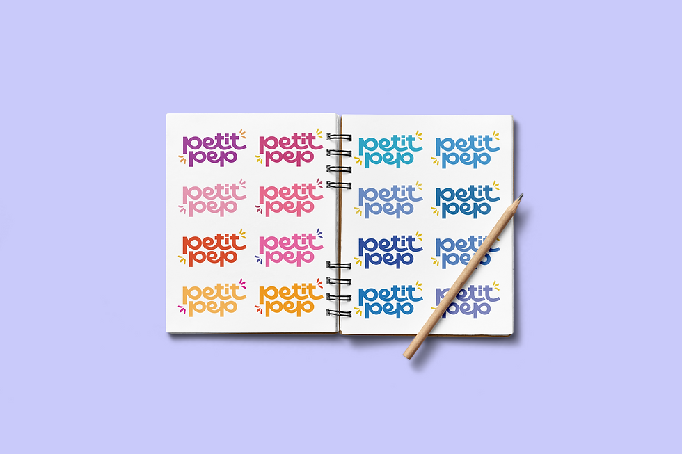
I began by explorations on the logo to focus on structure, weight, and balance. These experiments helped refine the logo’s personality, capturing a tone would feel gentle yet confident.
After finalizing the typographic form, I explored shades of blue to convey calmness, safety, and trust; qualities that align with the spirit of the brand.
Logo
These vibrant yellow lines, symbolize energy, positivity, and growth.

The "I" evokes innocence, growth, and nurture, reinforcing the idea that it’s designed for little ones.
The playful, rounded typography exudes approachability and childlike charm, capturing the joy of childhood.
Dust Blue
#585aa6
Yellow
#ffd126
Ice Blue
#a3dbed
Blush Pink
#ff7bbd
White
#fffffff
Black
#000000
Together, the palette balances softness and vibrancy, appealing to modern parents while maintaining a timeless aesthetic.


Elements
Brand Collaterals


Packaging


The selected keywords guided both the visual and structural choices, ensuring the design felt safe, gentle, eco-friendly, and engaging for modern parents.
I experimented with structural ideas that highlight transparency and storytelling, such as fold-down panels that reveal product information, cutouts, and pop-up elements.
Final Packaging


