

LAST SUMMER
Last Summer is a premium menswear label rooted in slow living, effortless dressing, and timeless style. Designed for modern men who value understated luxury, travel, and a more intentional way of living, the brand balances sophistication with a sense of nostalgia and ease. The visual identity is built on this philosophy through refined typography, a timeless colour palette, and thoughtful details that come together to create a brand experience.
Duration
5 Weeks
Field
Brand Identity
Brand Book
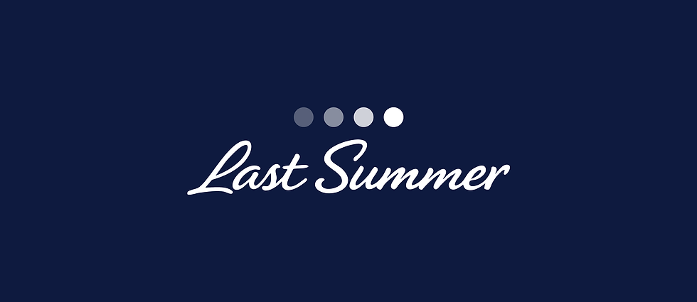


A flowing script wordmark brings a sense of effortless elegance and individuality. The four gradient dots symbolise the changing moments of a season, reflecting the passage of time and the quiet beauty found in every season.
The refined serif typography reflects the understated elegance and craftsmanship of the brand. Inspired by vintage travel stamps, the icon evokes memories of travel, transforming the identity into a symbol of timeless journeys, nostalgia, and the spirit of summer.
The typography reflects the timeless sophistication of the brand, paired with a manta ray the identity draws inspiration from the calm rhythm of the ocean, symbolising freedom, fluidity, and the relaxed spirit of summer.
A high-contrast serif typeface reflects timeless sophistication and effortless luxury. The icon represents movement and the relaxed rhythm, while the two dots symbolise the sun and moon, conveying balance and the timeless spirit of summer.
Logo Options
Logo

The final identity pairs an expressive, flowing wordmark with refined letterforms to capture the brand’s effortless approach to dressing. The sweeping strokes add a sense of movement and ease, while the elegant typography brings a timeless, nostalgic character. The stamp as the logomark is drawn from vintage travel ephemera which evokes journey, which reflects the idea of slow living. The sailboat, subtly shaped around the initials “LS,” creates a quiet connection to the brand

Brand Application


